<< back to all work


Grow.com - Builder Redesign

Grow.com provides BI to help small and medium businesses grow. I lead the design efforts to simplify what is required to get valuable BI. This includes a complete redesign of the Grow Metric Builder, introducing Datasets, a Data Warehouse, and creating new data transformation and visualization tools.


What should we work on?

One of the most interesting - yet most difficult - aspects of building any product is determining the most valuable thing you could make and spend your resources on. At Grow, we used a very simple but powerful framework to answer this question:
  1. Identify your most successful users (center of solvency)
  2. Figure out what they are doing with your product (benefit statement)
  3. Determine the required work to achieve the benefit statement (current reality)
  4. Finally, simplify the current reality so it’s easier for everyone to achieve the benefit.


Center of Solvency - Who are our most successful customers?

Identifying your most successful customers will vary greatly by industry business model, but it’s pretty simple for a B2B SaaS startup: Who has paid back their customer acquisition cost? This metric will reveal the customers who you have earned money from before churning. These are the customers who are making your company money. We define this as our Center of Solvency.


Benefit Statement - Why are our customers using Grow?

The next step is understanding how our successful customers use Grow and the benefit they receive. The whole team (Design, PM, Dev, and QA) contacted every customer who was willing to talk and asked these questions. We discovered our customers use Grow to create actionability, accountability, and visibility across their organization. After gathering why the customers use Grow, we analyzed hundreds of their metrics and dashboards to find exactly what they were building. We overwhelmingly found our users creating Executive and Department Level Sales and Marketing Dashboards.


After examining the the metrics and dashboards our customers were creating we found most to be Sales & Marketing related.


Current Reality - What does it take to achieve the benefit statement?

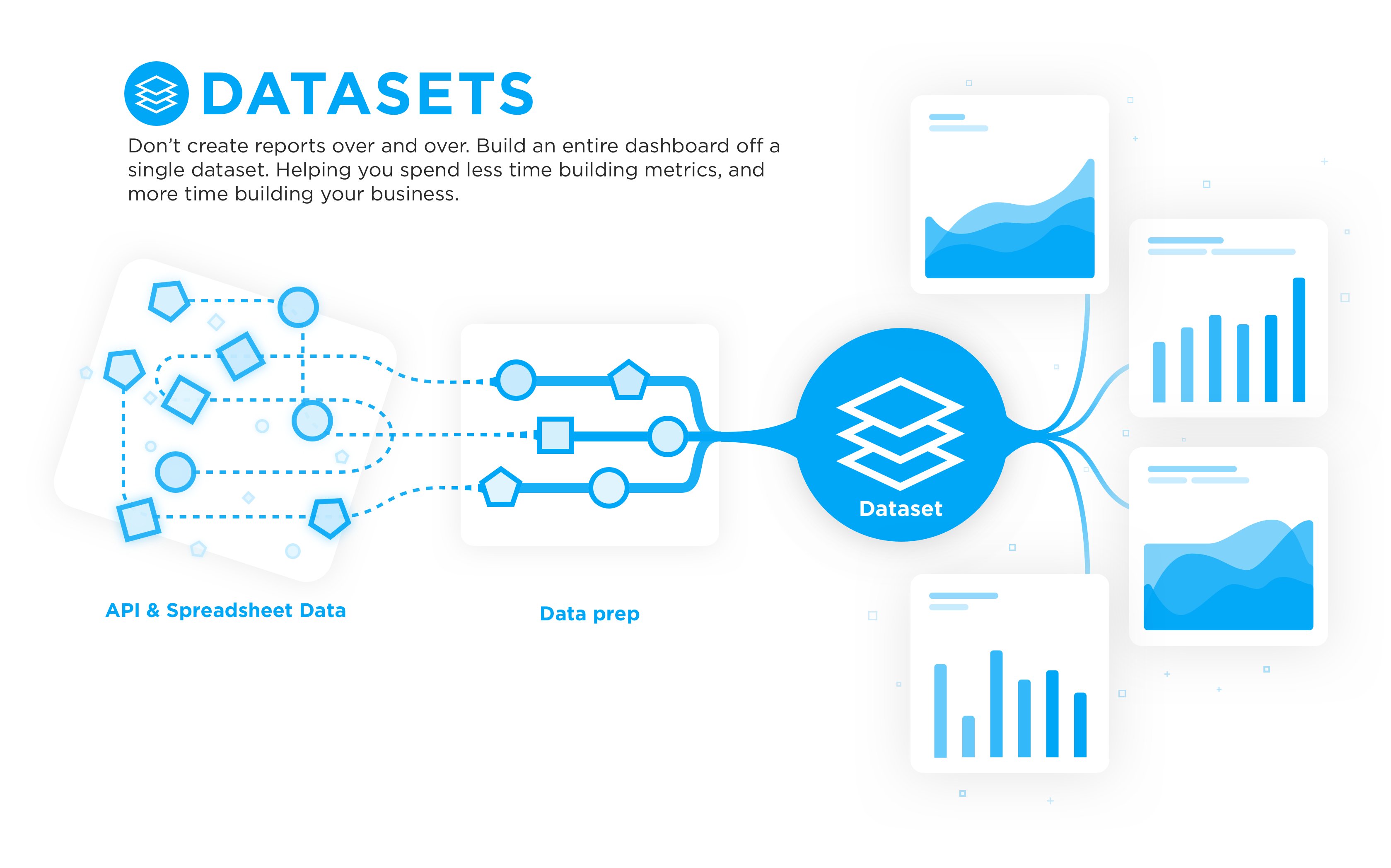
Next, we wanted to find out exactly what work was required to get Executive and Department Level Sales and Marketing Dashboards that provide Actionability, Accountability, and Visibility using Grow. What does the user experience, from their first sales call, to their first login, to building a complete suite of sales and marketing dashboards?

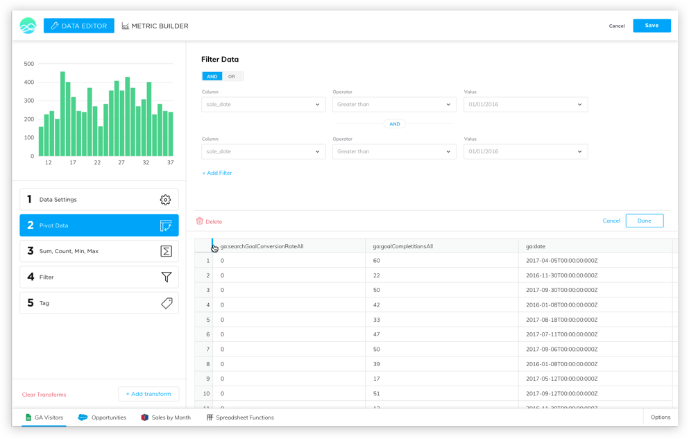
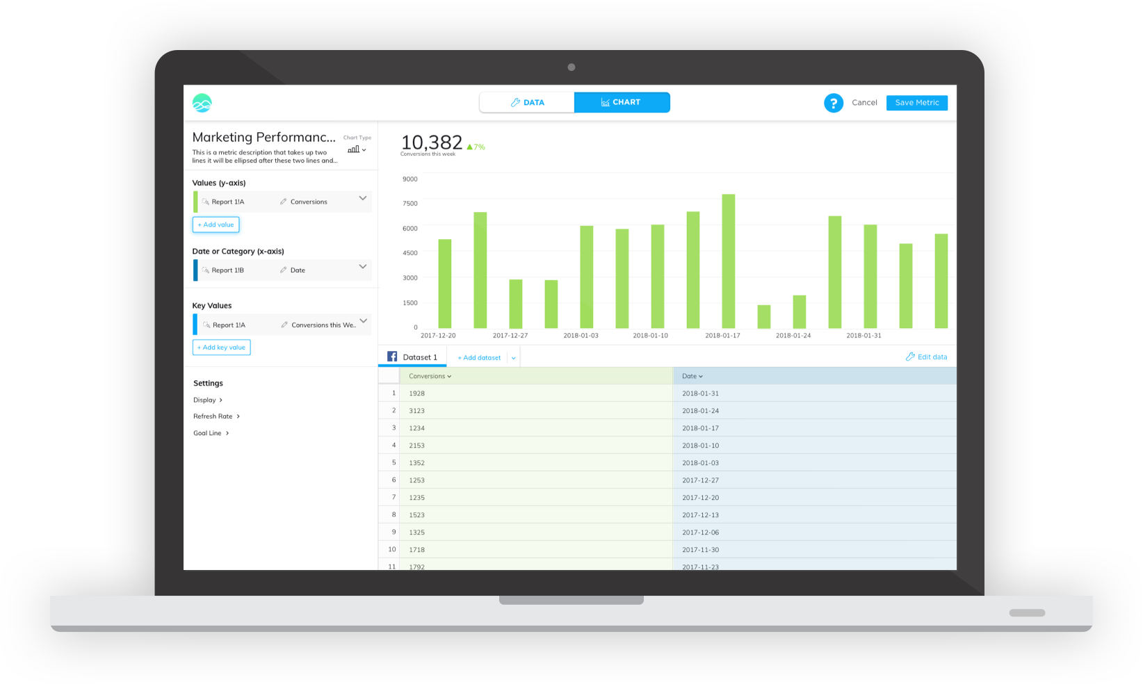
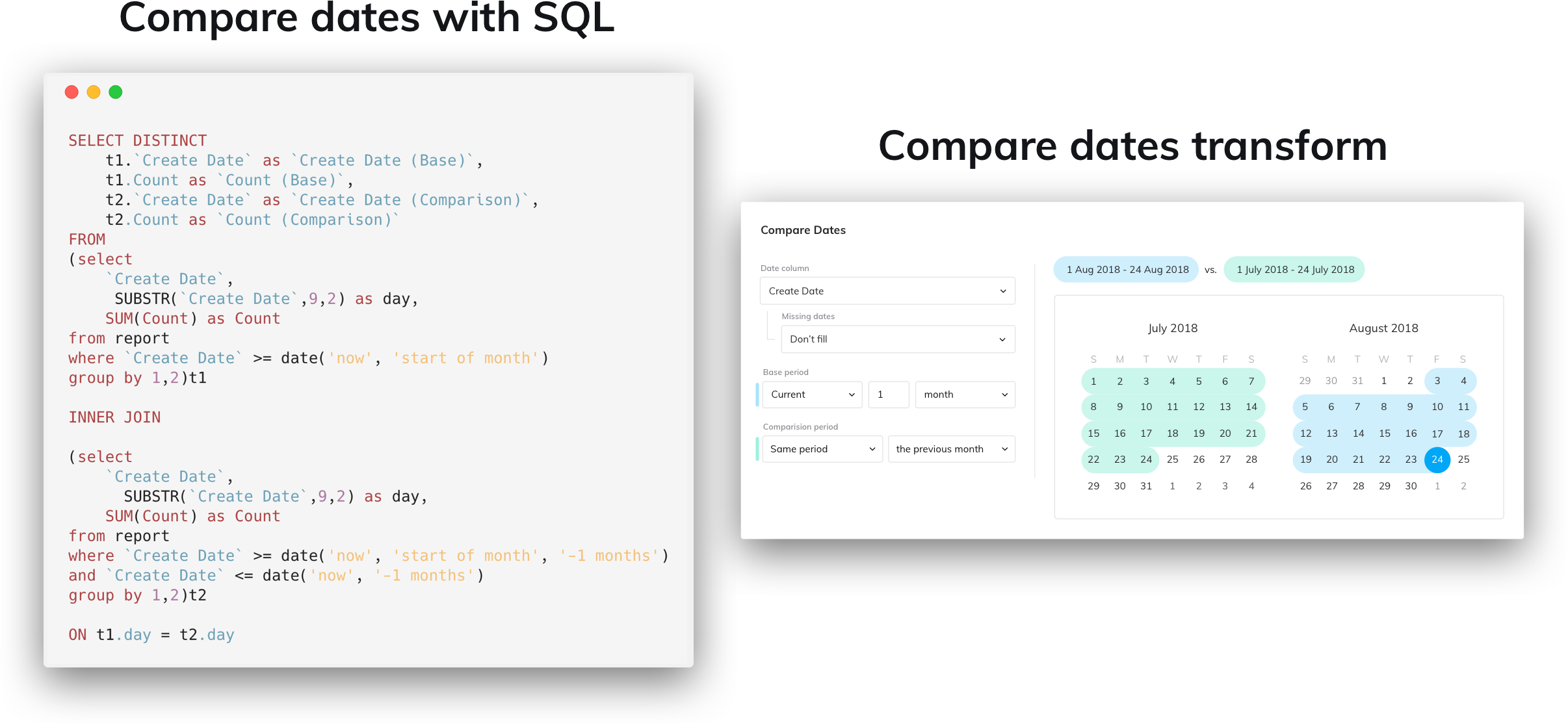
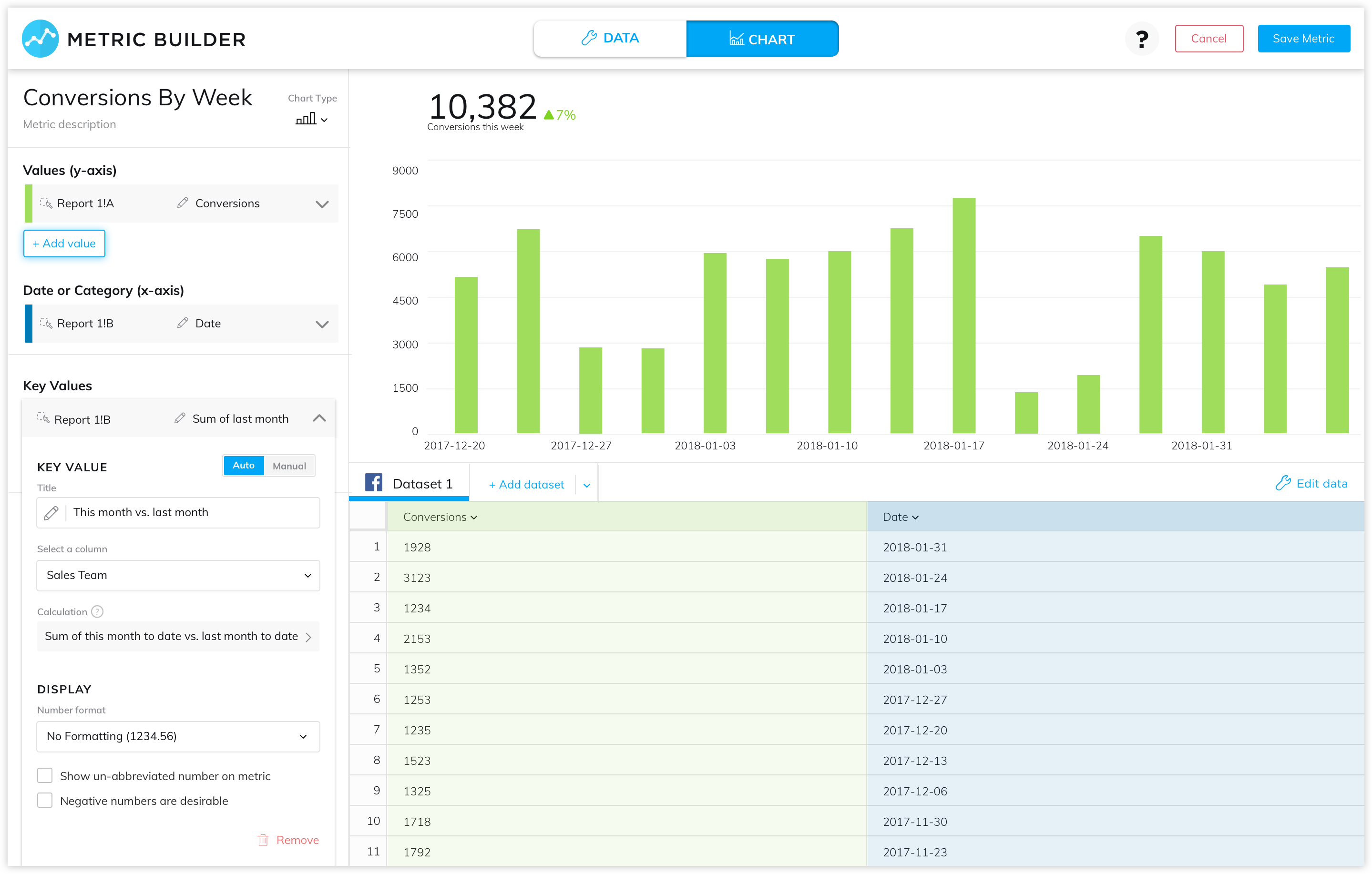
We printed, documented, and analyzed every step of this process. With the help of our customer success team and product experts, we were able to establish the Current Reality and identify pain points. The most painful parts of the Current Reality were focused around building metrics (sourcing, cleaning, preparing, transforming, and visualizing data). This made sense. Grow wasn't originally intended to build custom metrics - there wasn't a strong product vision, and features were added as requests came in. We eventually had a metric builder that got the job done, but using it was painful to use and required specialized knowledge.


The end result of mapping the current reality of Grow. This is everything a user must go through to achieve the benefit of Grow. We found metric building to be the most difficult and painful part of the current reality.


Vision & Shared Purpose

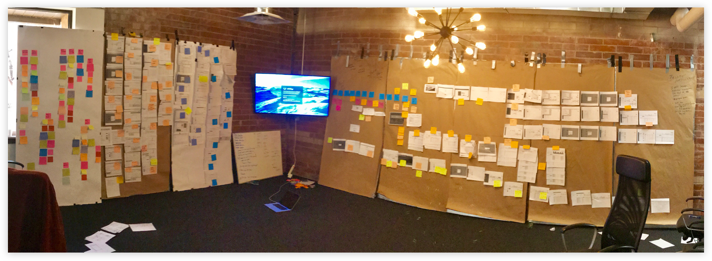
I believe what leads to creating a product is ensuring everyone is working to solve the same problems, is heard throughout the process, understands the vision, and believes in what we're building. This is why we had the entire product and engineering team working on the entire design process, from calling up customers to sketching designs.

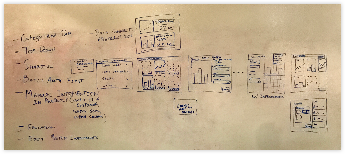
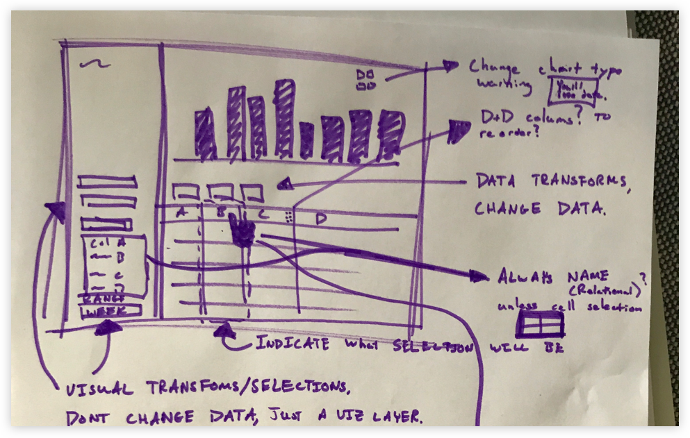
After learning was needed to make the metric building process easier, the entire team sketched their ideas, shared their ideas, sketch more ideas, shared those ideas, teamed up, sketched team ideas, and shared. This brought out everyone's ideas, spread the intelligence, and the best ideas were selected.

The team came together on a vision of a redesigned metric builder, but we all knew what we came up with wasn't what we were were going to build. That required more research, understanding, and design. The output of this process isn’t product specs, but a team that deeply understands what we were trying to accomplish, that has a shared vision, and has contributed to a solution.


The vision that the entire product and engineering team developed. The goal here is not to determine exactly what to build, but to develop shared purpose across the entire team.


Design & Building

Finding our Guiding Insights - More Design Research

Now that we had a vision, we needed to validate and iterate on it. This consisted of user interviews and observing hundreds of metric building sessions in the original Metric Builder. From this research we found several key insights that guided the rest of our design:
  1. There are two primary activities that occur in the builder: data preparation and charting.
  2. The existing information architecture of the metric builder did not match our users mental model of building a metric.
  3. There are many data transformation patterns that appear over and over in sales and marketing metrics. For example: tagging data and comparing date ranges.
  4. It is very common for different metrics to use the same set of data.
  5. Many of our metric builders do not have the necessary skills to prepare data.
Insights 1, and 2 were directly related to the builder redesign, while 3, 4, and 5 spawned additional projects focused on simplifying the metric building experience for users without data knowledge.


Design, Prototype, & Test

With these guiding insights, we started designing. We began with sketches and feedback from internal users, then worked through iterations of the design, consistently getting feedback from internal users and customers. We created a prototype of the current design on Monday, followed up with 4-5 user tests on Tuesday, iterated the design on Wednesday, performed another 4-5 user tests on Thursday, and finished the week preparing designs for the next week. Three weeks of intensive testing and consistent user feedback is what I believe led to the success and immediate adoption of the builder after release.


Initial sketches of the builder.
 
 
This information architecure didn't work. It didn’t help the user in their flow through the application. We needed to make data work and charting work seperate activities.
 
 
There are too many activities avaliable on the page at once. If everything is there nothing is there. Even though data and chart are different activities, you need to be able to see your chart while manipulating data.
 
 
Layout can be more intuitive, keep things in the same place between pages. For example, swap chart and pipeline.


Develop

While we were designing and prototyping, the development team was busy laying the architectural foundations for the new builder. This allowed both the product and engineering teams time to prepare a successful product. The team did amazing work developing the new builder. It was finished ahead of schedule and included more features and content than we originally anticipated. Again, I believe this was due to the whole team having shared purpose.


Release, Feedback, & Iteration

Ultimately, we released an alpha to partners and internal users. We were able to find and fix a majority of the bugs during this time. Afterwards, we released a well tested beta to our power users. We performed regular feedback sessions with them during this time. The beta went so well we ended up accelerating the release of the builder to a general audience.


Making building easier for non-builders.

With the Metric Builder successfully released, we started working on new features that would make preparing and charting data easier, especially for users without advanced data knowledge. BI is much more useful for an organization if everyone is able to answer questions with data, regardless of their data skill. Using the insights we discovered through past research, we designed, analyzed, and built several new features for the builder, making it easy for users without data knowledge to get valuable BI.


Tagging and Date Comparison Transforms

There are many patterns that appear over and over in Sales and Marketing metrics, such as tagging data and comparing date ranges. These patterns previously required SQL knowledge, but we built tools to allow anyone, regardless of data knowledge, to tag their data and compare dates.


Datasets

Our research discovered that many organizations only have one person with the data skills necessary to source and prepare data for visualization. This prevents most individuals from using data to answer the questions they are interested in. Coupled with this, we found that people used the same data over and over across different metrics. With these insights we researched, designed, and shipped Datasets and the Dataset Builder. Datasets allow users with data knowledge to save collections of prepared data and share them across their company. With Datasets, creating metrics is no longer limited to users who have advanced data knowledge.
 
 
With dataset you can leverage one individual's skilled datawork across the entire organization.


Chart Level Transforms

We found that it is extremely common to build multiple metrics with different views of the same data. An example is a "Sales Month to Date” vs. “Last Month to Date" metric. Both metrics use mostly the same data as "Sales this Month By Sales Rep." We realized that these metrics are the same data with a different date range, date grouping, and category grouping (pivot table). Building these metrics took a massive amount of skilled data work. To make it easy on the user, we identified these patterns and simplified them to a single menu. With “Chart Level Transforms,” users can view their data however they want, without having to think about how they need to manipulate their data.
 
 
With chart level transforms you can view your data however you need it without needing to think about manipulating the data.


Automatic Key Values

A Key Value is the big number displayed on the top left of metrics. Key values summarize the metric into a single value, and are vital to getting value from a metric. The only problem is… they’re hard to calculate, and getting a useful key value takes a lot of work. We found the standard procedure was to duplicate a report, filter it to the date range of interest, and perform an aggregation (and if you want to compare it, you had to do all of that twice!). So we built “Automatic Key Values” to address this issue. As soon as a user charts data, these key values are generated, eliminating all the work required.
 
 
Key values were previously tedious to create. Now they are created for you.


<< back to all work